Hi all,
following yesterday's post I once again wanted to give you a step by step account on the processing of a picture.
This time it's
"Contis-Plage" on a Cloudy Day"
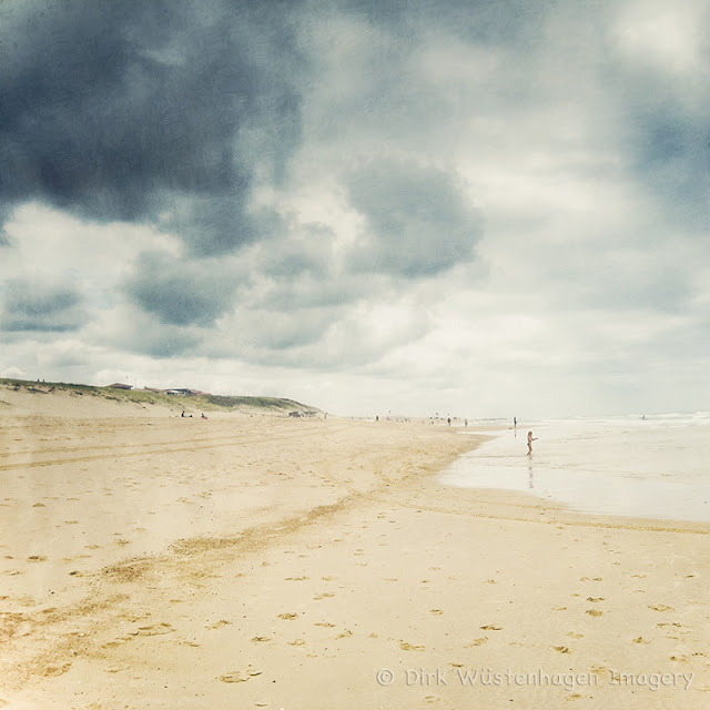 |
| Contis - Plage on a cloudy day |
|
1. Processing in Lightroom
I took the pictures that I used with my old Canon Ixus 70, so I had to deal
with jpg-files, which limited my processing in Lightroom. Fortunately I
took these shots with the intention of merging them together in Photoshop
to get a bigger pic in the end.
Even though it wasn't a typical sunny day I wanted to retain the holiday feeling and thought soft almost pastel tones might be the correct way to go.
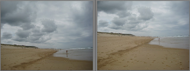 |
| SOOC - Version |
The sharpness in this was quite good and there was no noise to speak of, so I didn't have to do any sharpening and only a bit of noise reduction after the processing.
Over all the pictures were much too dark andto bring up the darker middle tones. Additionally I used a gradient filter for the sky to darken the clouds a bit and to get more depth. I also pushed the yellow luminance and added a partial toning - dark blue for the dark tones a light yellow tone for the lights. After a lot of trying this and that I finally was satisfied with the colours and light:
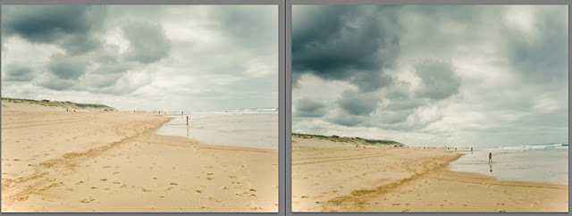 |
| Lightroom processing |
2. Creating the Vertorama / horizontal panorama
I exported these two pictures and loaded them into Photoshop. As my standpoint was when I took these was the same and I had almost half of the pictures overlapping I didn't expect any problems stitching these two pictures together. All I had to do was to go to PS Photomerge - tool and let the automatic merge the pictures. I made a square crop of the merging result and began to texturize the picture.
3. Adding textures
The further processing's focus now lay on pushing the light a little bit more with the help of textures as well as adding a sublte colour contrast.
I prepared a screen shot of the PS layers for you to show what I did:
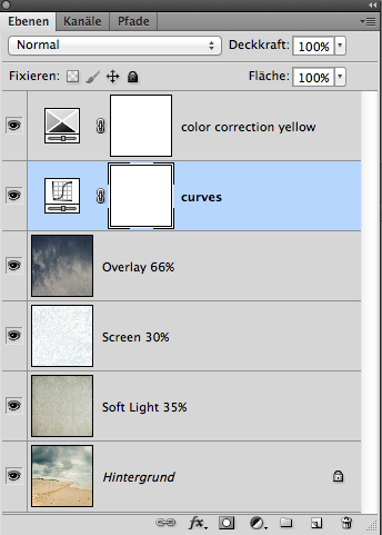 |
| Layers |
As you can see I chose three textures
- the first is one with a very fine structure and a neutral tone. The blending mode "Soft Light" helped to enhance the overall brightness while adding a subtle texture to the darker tones in the picture, especially on the dark clouds.
- the second almost white one pushed the light to its limits reducing the contrast, but that is something one can regain later with the help of curves or levels.
- the third one I took because of the gradient from silvery to dark blue. Overlay at 66% gave the clouds a wonderful dark blue tone and added some more texture while keeping the yellow / brighter tones.
As pointed out before I used a curves layer to work on the contrast until I was satisfied.
4. Colour Correction
I wanted to have a subtle, but almost perfect colour contrast. I sometimes check the colours in my picture with the help of a colour wheel to see whether I can tweak them to a perfect harmony. I discovered the following side that I find very helpful:
colorschemedesigner.com
You can copy the colour code in Photoshop and see which colours go with it. Its quite helpful and sometimes a great inspiration.
There wasn't much to correct on the colors, I only took a bit of red out of the yellow to achieve the suggested harmony of the color wheel.
Hopefully this
making of was helpful and please check out my textures if you like.
Thanks!


Really appreciate this!! Thank you!!
ReplyDeleteWell done! :-)
ReplyDelete